
Coloured Suits Can Take Your Style To Bold New Heights; Here’s How To Do It Right
It’s time to wave goodbye to the days where navy blue and charcoal grey were the first and only colours available to men.
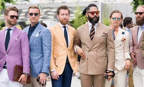
It’s much more acceptable to incorporate the fringe colours – pink, purple, yellow – than ever before. It’s also really easy to go that way and look like you don’t want to be taken seriously.
Plainly speaking, there’s a right way to do colour, and a wrong way to do it. Too much colour and you’re a Pitti Uomo caricature that can’t be trusted. Too little, and everyone will think you took the Godfather a little too seriously or work for the government.
Here’s the breakdown on how to take advantage of colour in your wardrobe, and how to straddle the fine line between not enough and far too much.
Coloured Staples First

When taking stock of your wardrobe, stick to the staple colours first. Navy, charcoal, and neutrals are enduring sartorial staples and it’s not just fussy conservatism or tradition for the sake of tradition keeping them afloat.
These staple colours are timeless, versatile, and immune to trends. They’re not going out of style this century. Generally, they can be worn in both summer and winter. They’re foundational colours that you can use to contrast with bolder, on-trend colours.
That, and the staples look good on everyone. Even pasty, sun-starved guys like me look good in a navy suit, and chances are you might too.
Pick Your Colour Based On Seasons

Do you cringe at the thought of the overdressed wanker in the office going on about his ‘summer rotation’?
It sounds tragic, but it’s legit – to a point. Some colours just work better in summer than they do in winter, and vice versa.
Darker colours retain more heat, for example, and can look harsh on warm days. Whereas cooler, neutral tones complement the seasonal changes and make your time in the sun a hell of a lot more tolerable. This isn’t a fixed category, so feel free to experiment, but it’s worth keeping in mind.
Beware The Suit Colour Salad
If there’s anything to avoid, it’s mixing colour like you’re a five-year-old with access to six buckets of paint and no parental supervision.
Sure, it’s good to be enthusiastic. But too much colour can make you look indelicate, try hard, or clueless, or a forbidding combination of all three.
We’ve all seen photos of those guys at Fashion Week, or on the wall at Pitti. Their colour salad outfits scream ‘look at me’, and not in a good way. Less is more, gents. A good rule of thumb is to have one anchor colour and a complementing bolder tone to keep things interesting.
Use Colours In Suiting Sparingly

You may have heard the ‘pop of colour’ expression. Sounds trite, but it’s a thing. Aim to use small quantities of a bold colour to lift your outfit.
It can draw attention to key outfit pieces – a tie, pocket square, or accessory – and add some enlivening contrast to an otherwise dull look.
But again, restraint is more important than the colour itself. A pink tie with a navy suit looks great. But a pink hankie, pair of socks, shirt, and tie will have you looking like a real estate agent in a marquee at the races.
Use The Colour Wheel To Help With Suit Colours

If you do want to mix it up with different tones, we have one suggestion. Look up the colour wheel. It’s a universally-accepted framework for optimal colour marriages, and which colours should avoid each other like Steve Stifler and polite company.
The colour wheel also points you towards tones that make optimal complement and contrast combinations. If you’re struggling for shirt and tie combos, or can’t quite figure out which shade works with which, the colour wheel is a brilliant tool that takes the hard work out of your hands.
Employ Colour Blocking In Your Wardrobe

Tired of the same old tricks? Try colour blocking. Commonly associated with Dutch artist Piet Mondrian, the technique combines two or three solid colours in distinctive, separate blocks. It’s a bold and dramatic look, and by no means for the faint of heart.
It does, however, play tricks on the eyes. It can make you look taller if you need it, and even leaner if you pick darker tones.
However, it’s easy to get it wrong, so start with two complementing colours and work your way towards riskier combos that incorporate clashes